WPで横3行×縦複数行・文字下表示の設定
画像の下に文字/PC3列・スマホ2列・外部CSS等を使わない。
<!-- ==============================
① 表示内容の指定(Cocoonショートコード)
・cats="5" → カテゴリーID
・count="30" → 表示件数
・type="large_thumb"
※「on」が付くと文字が画像の上に乗るので使わない
・bold="1" → タイトル太字
・snippet="1" → 説明文(抜粋)を表示
============================== -->
<div class="custom-card-area">
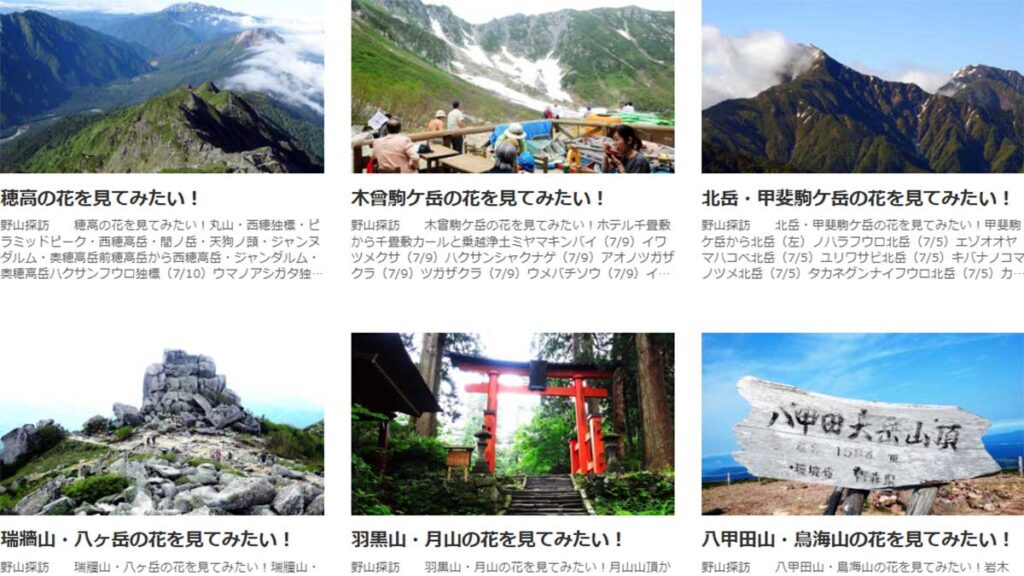
[new_list cats="5" count="30" type="large_thumb" bold="1" snippet="1"]
</div>
<style>
/* ==============================
② カード1枚の基本構造
・flex-direction: column
→ 画像 → 文字 を縦に並べる決定打
============================== */
.custom-card-area .entry-card-link {
display: flex !important;
flex-direction: column !important;
text-decoration: none;
color: inherit;
}
/* ==============================
③ サムネイル画像
・width:100% → 横幅いっぱい
・height:auto → 縦横比を保持
============================== */
.custom-card-area .entry-card-thumb img {
width: 100%;
height: auto;
display: block;
}
/* ==============================
④ 文字エリア(画像の下)
・position: static → 重ね表示を完全に無効化
============================== */
.custom-card-area .entry-card-content {
position: static !important;
background: none !important;
padding-top: 6px;
}
/* ==============================
⑤ タイトル
============================== */
.custom-card-area .entry-card-title {
font-weight: 700;
font-size: 15px;
margin: 0 0 4px;
text-align: center;
}
/* ==============================
⑥ 説明文(抜粋)
・-webkit-line-clamp: 2
→ 最大2行で省略
============================== */
.custom-card-area .entry-card-snippet {
font-size: 13px;
line-height: 1.6;
text-align: center;
display: -webkit-box;
-webkit-box-orient: vertical;
-webkit-line-clamp: 2;
overflow: hidden;
}
/* ==============================
⑦ PC表示(768px以上)
・3列表示
============================== */
@media screen and (min-width: 768px) {
.custom-card-area .new-entry-cards {
display: grid !important;
grid-template-columns: repeat(3, 1fr) !important;
gap: 16px;
}
}
/* ==============================
⑧ スマホ表示(767px以下)
・flex指定を殺して grid にする
・2列 × 複数行
============================== */
@media screen and (max-width: 767px) {
.custom-card-area .new-entry-cards {
display: grid !important;
grid-template-columns: repeat(2, 1fr) !important;
gap: 10px;
}
}
</style>
・このまま固定ページのカスタムHTMLに貼る
・カテゴリーを変える:cats=”12″
・表示件数を変える:count=”12″
・文字を画像の上に(非推奨):type=”large_thumb_on”
・スマホ1行表示:grid-template-columns: 1fr;
・PC4行表示:grid-template-columns: repeat(4, 1fr);
・3行説明文:-webkit-line-clamp: 3;
・説明文削除:snippet=”0″
・左寄りタイトル:text-align: left;
・文字サイズ変更:font-size: 15px;